OUR LOGO
Our logo works best when it has room to breathe. By using the height of the ‘W’ as a guide for how much room to leave, we can always ensure that our logo stands strong on any piece of collateral. The smallest the logo should ever be sized down to is 30mm, and 180px for web.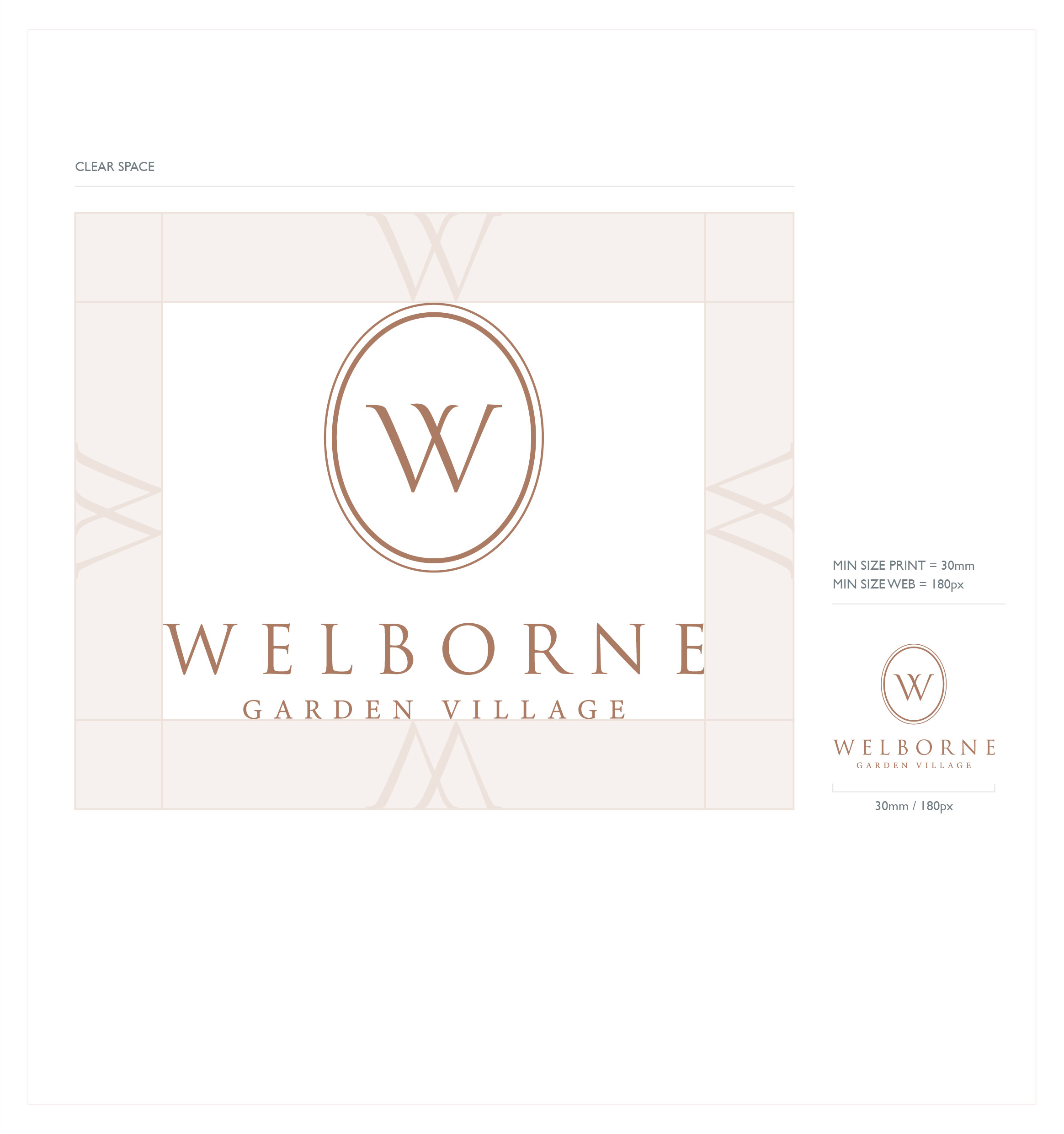
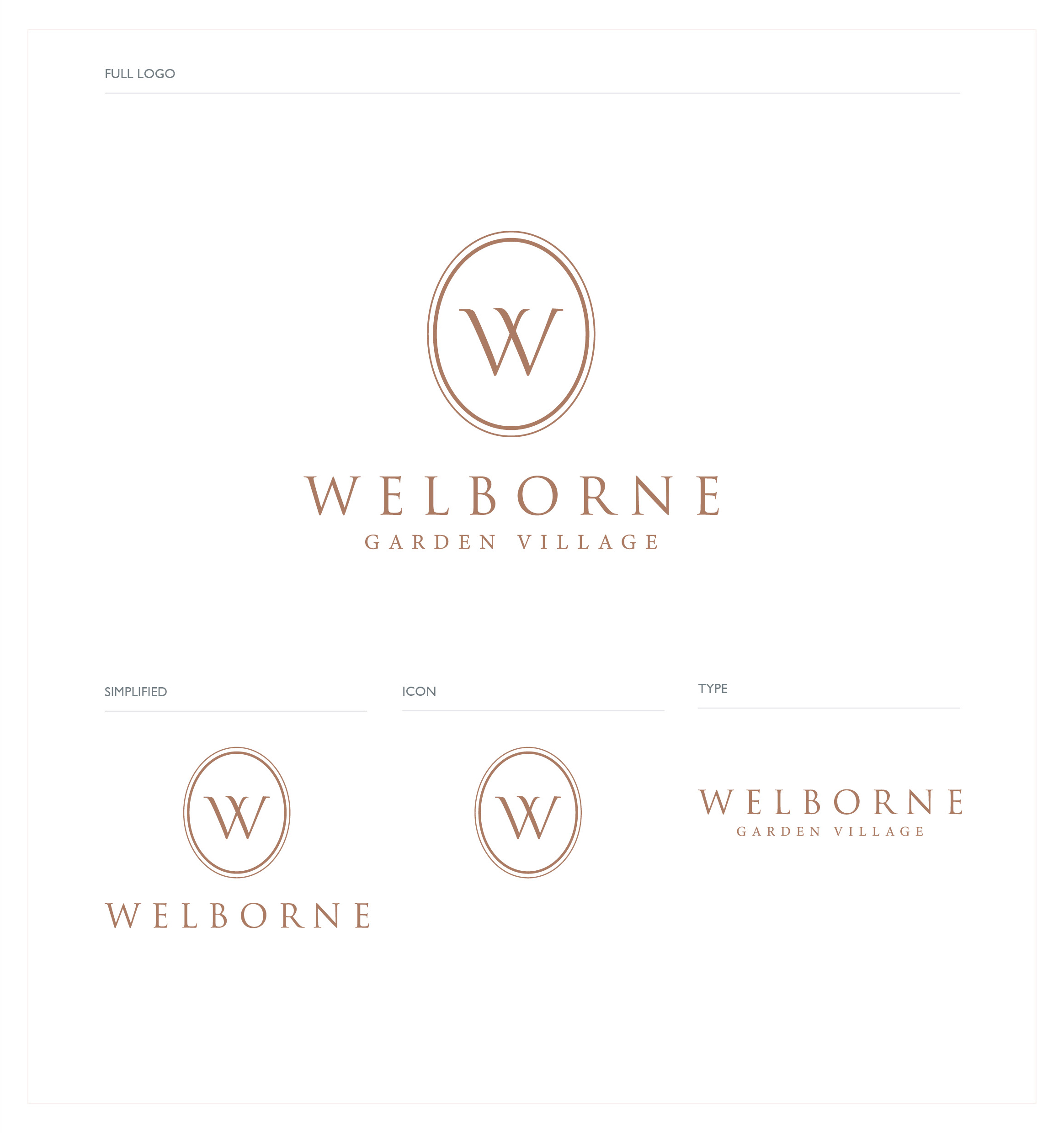
LOGO USE
There are three different ways in which the logo can be used. The full logo should always be used up front when possible e.g. for a front cover of a brochure. Having the flexibility of splitting out the logo is testament to the strength of the brand – but must always be considered before doing so. Examples of splitting the logo out in this way could be to accompany a piece of photography, within signage on site, or as an icon for the website.
LOGO COLOUR USE
LIGHT
Use of the light logo would be suggested for things such as letterheads, inner pages of brochures.
DARK
Suggested scenarios for the dark logo would be front covers, business cards, email headers.
MONO
The mono variations are to be used when there is no option for full colour.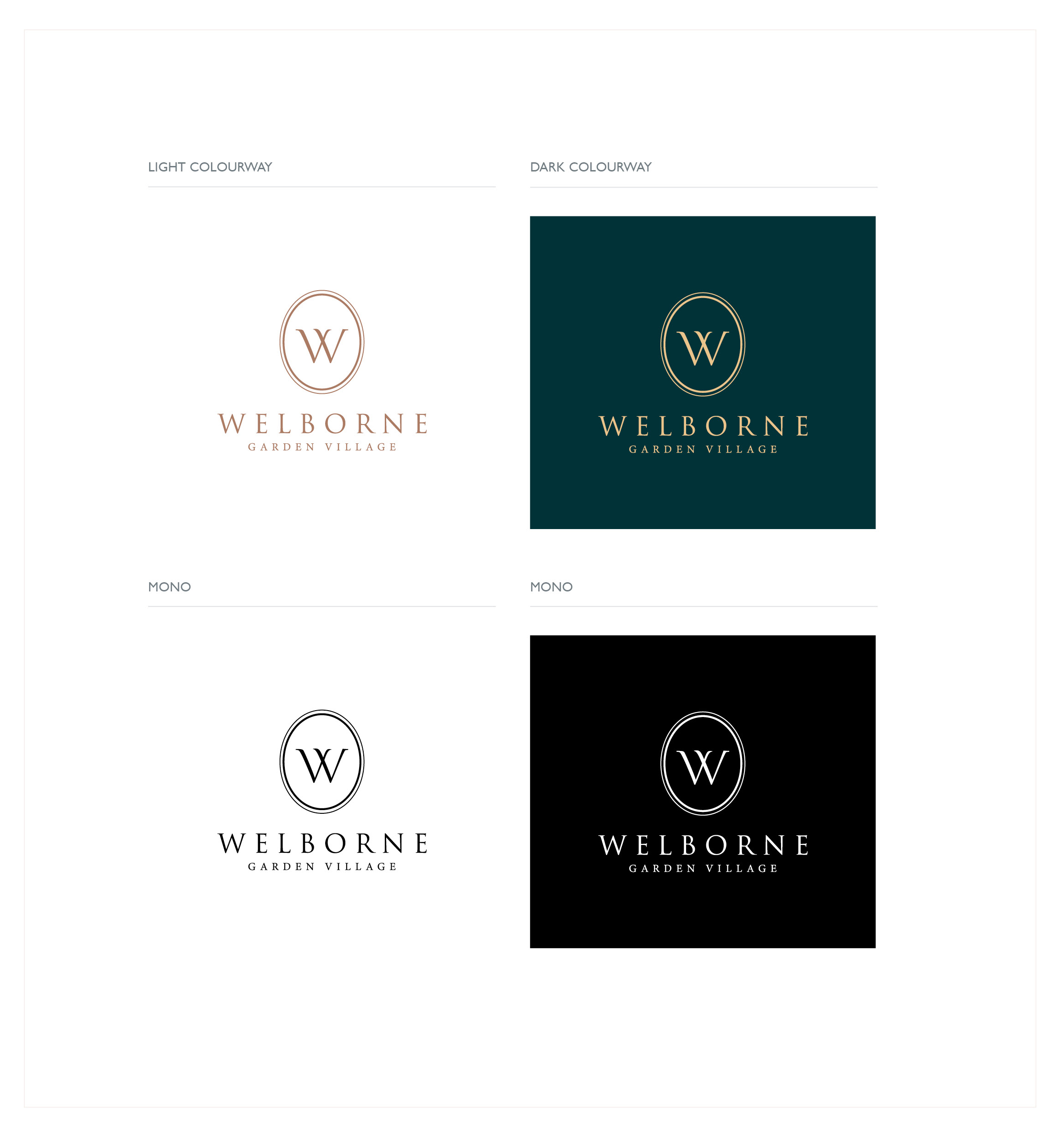
This is an excerpt from our brand guidelines on how to use our logo.
View the full brand guidelines here.