OUR COLOUR PALETTE
We have two ways to approach use of colour in our palette – this is light and dark.
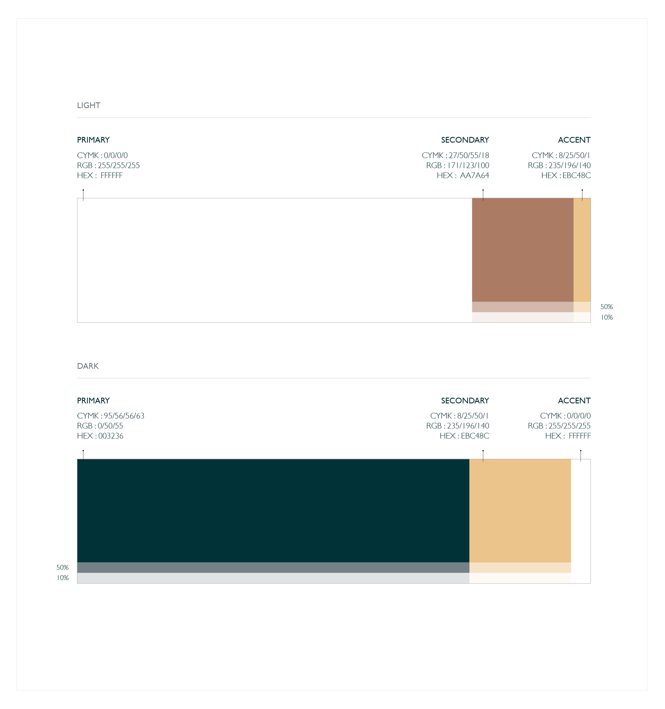
Our light palette consists mainly of white backgrounds with the secondary colour used for things such as the logo or text. The secondary and accent colour can also be used at 50% and 10% when needed.
A similar process is used in our dark palette, using the dark green as the main holding colour and the secondary and accent colours to stand out against it.
This is an excerpt from our brand guidelines on how to use our colours.
View the full brand guidelines here.